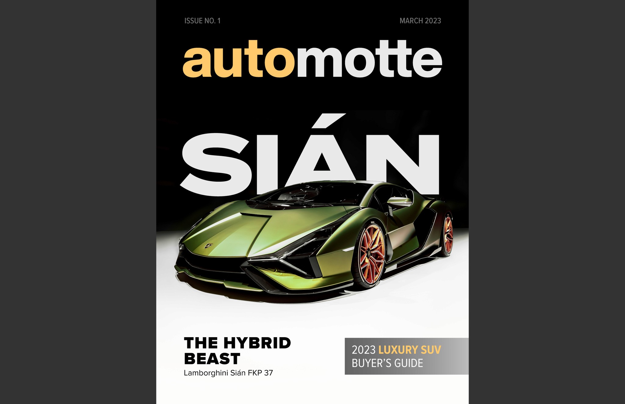


For this assignment in my Graphic Design Media Management class, I was tasked with establishing the visual groundwork for a digital magazine. I decided to conceptualize a luxury automotive magazine that I named Automotte.
I began the creation of the magazine with the cover. To embody the luxurious, modern, and professional feel that I intended for the magazine, I designed a simple sans serif wordmark logo to use for the masthead of the cover. I came up with the idea of changing the color of "auto" based on the cover's imagery in order to add more visual interest. After sourcing images of a car to be the focus of my cover and article, I crafted a simple yet impactful cover that sets the magazine apart from the competition.
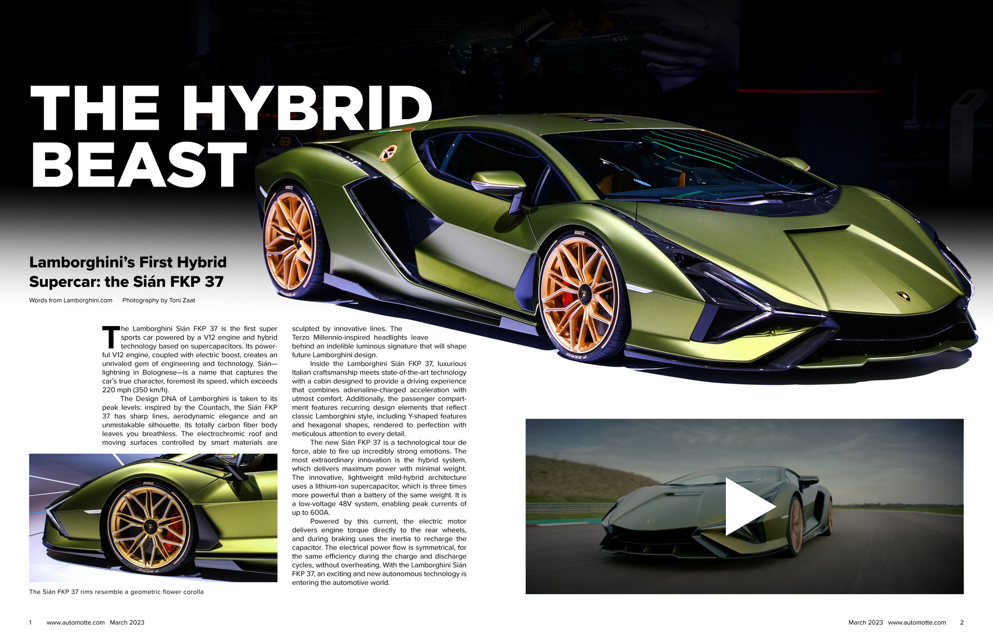
Next, I designed a table of contents spread. I decided to use the term "Owner's Manual" rather than "Table of Contents" in order to give the magazine a more clever personality. I then went on to design two spreads for an article about the car from the cover. Part of the assignment was to make our magazine have an interactive feature, so I added a video thumbnail. On the PDF file of the magazine, a click of the thumbnail's play button transports readers to a video about the car.
