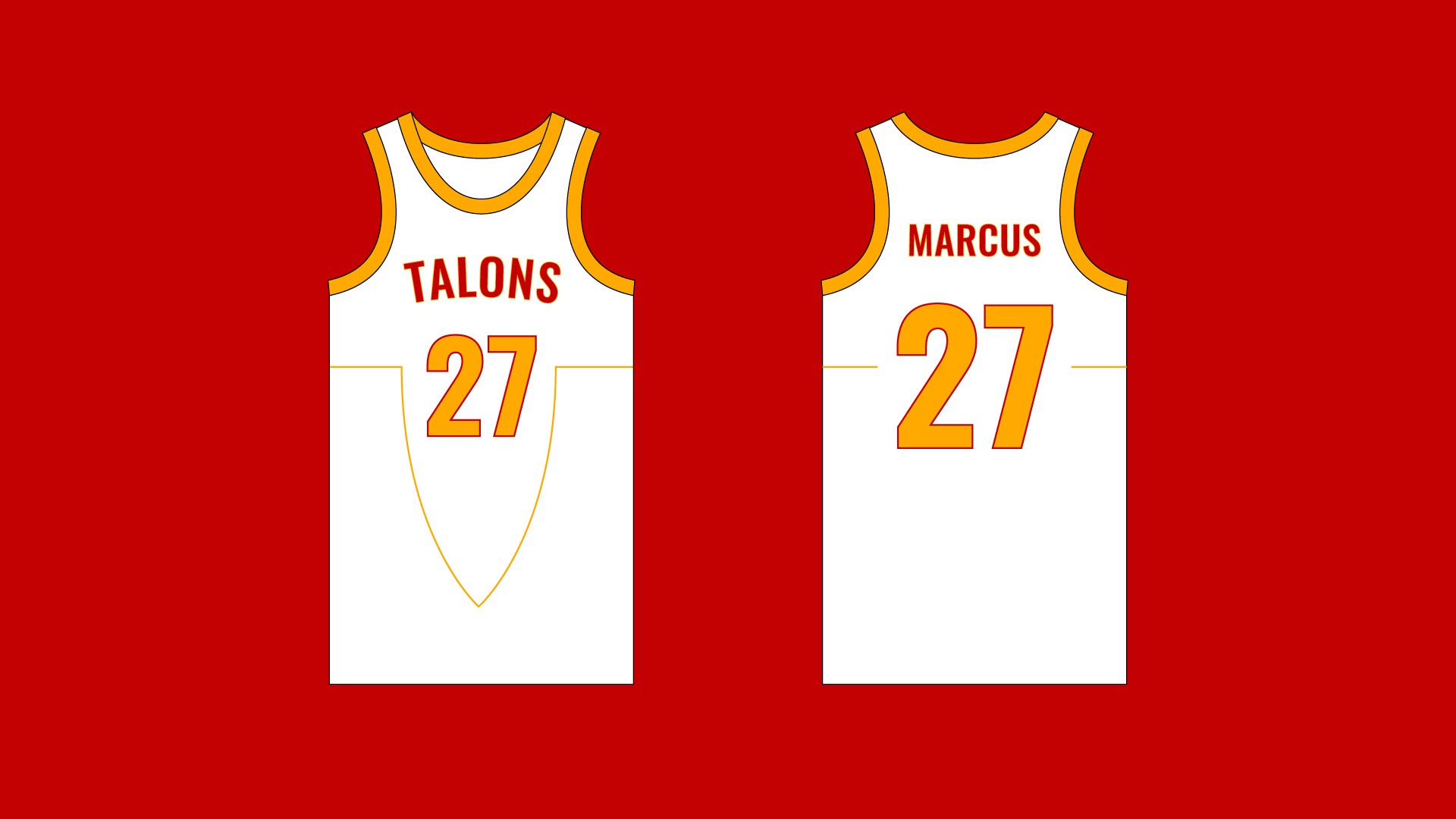
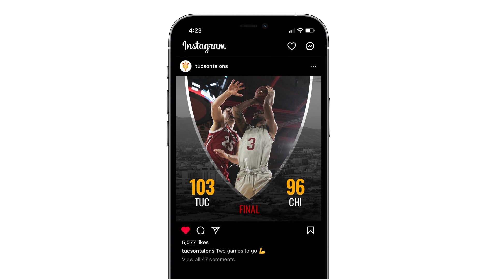
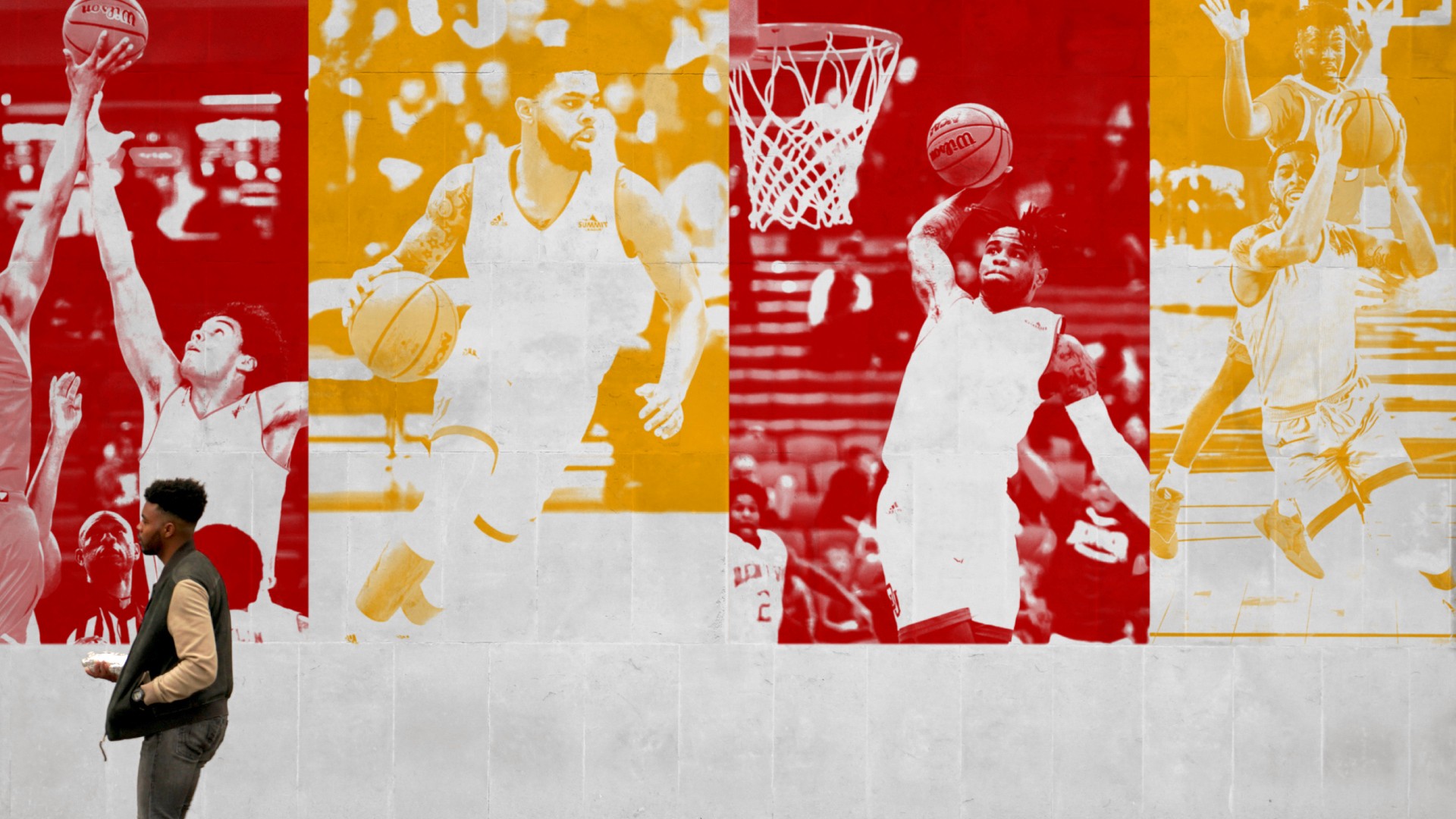
For this assignment in my Graphic Design Studio 1 class, I was tasked with creating NBA team branding for a city that currently does not have an NBA team. From a short list of selectable cities, I chose Tucson, Arizona.
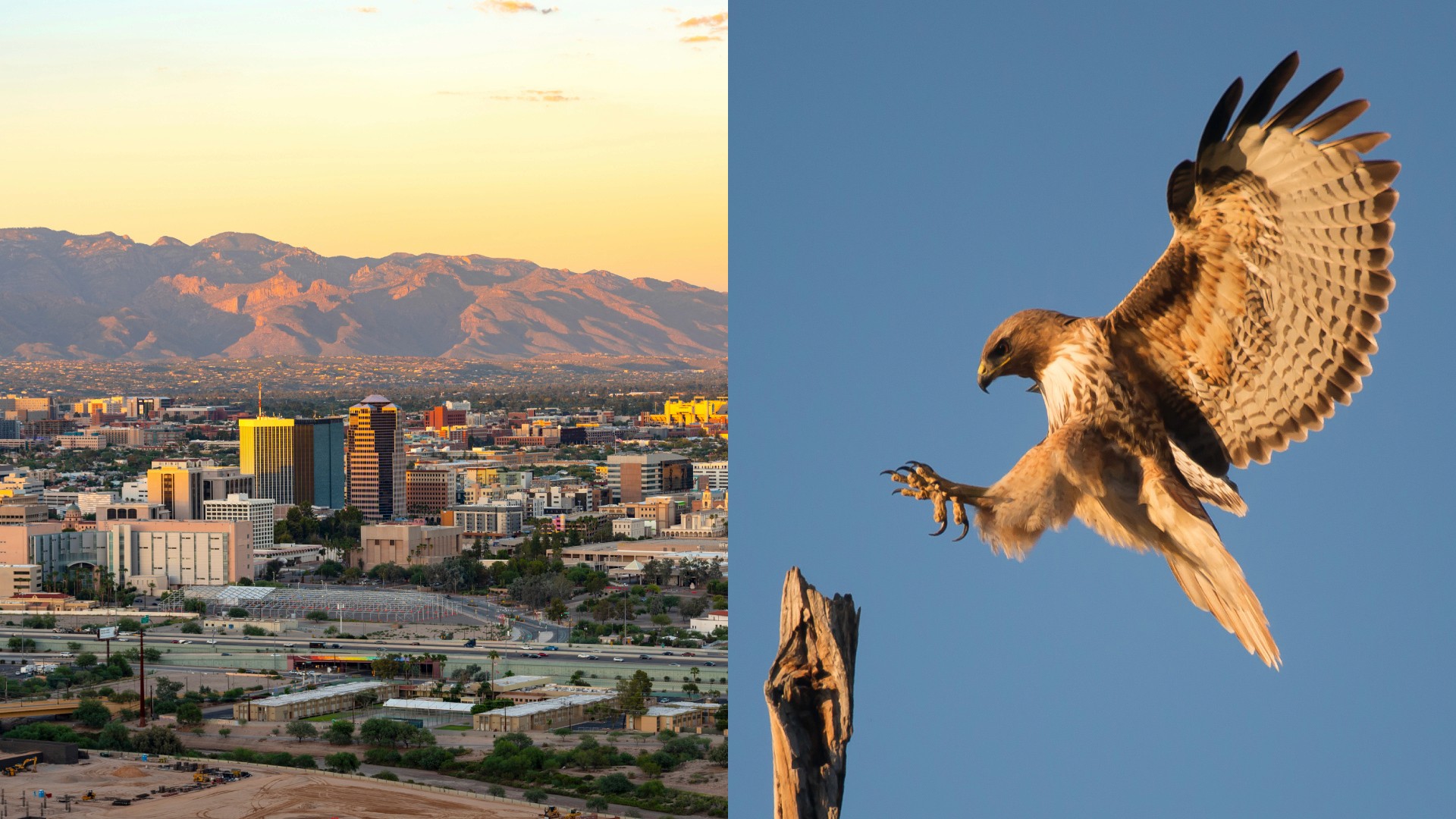
To begin, I needed to come up with a name for the team. After much research and deliberation, I came up with the name Tucson Talons. This name works for many reasons. For one, the name references the red-tailed hawk, a magnificent bird and a familiar sight in Tucson. Additionally, Tucson is situated in a desert area, which further supports the use of 'talons,' as birds of prey are commonly associated with deserts. Moving beyond the meaning of the name, the two words of the name both start with 'T,' and contain the same number of letters, creating a catchy name that is easy to design balanced visuals around. Lastly, the name 'Talons' is highly relevant to the sport of basketball, as the elements of speed and snatching play a significant role in the game.
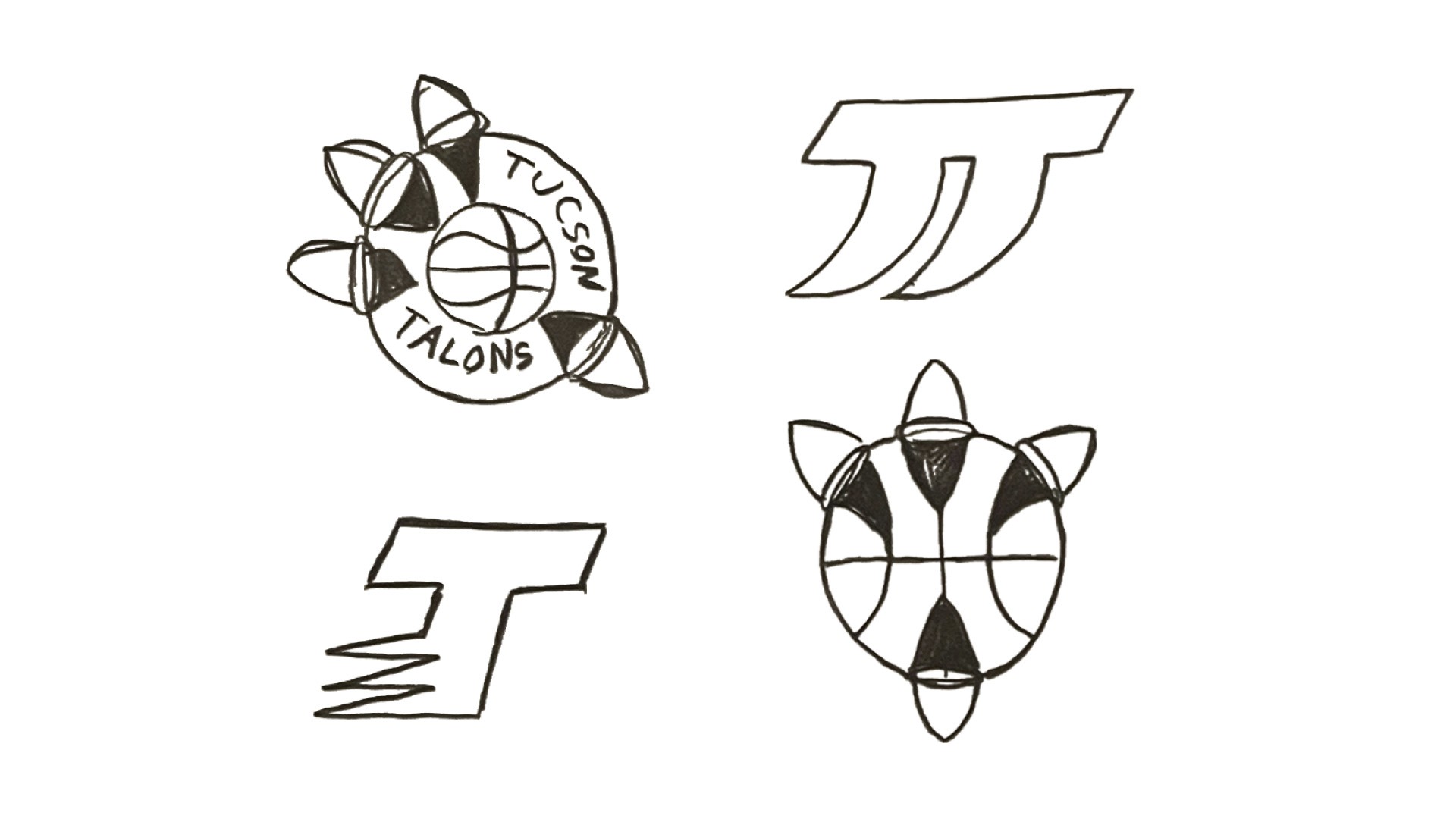
After I had decided on a name for the team, I moved on to the logo. In my sketches, I primarily pursued two approaches: combining the 'T' with an abstract depiction of talons and presenting the talons more directly. I chose to move forward with the sketches that were more pictorial, as I felt they were more effective in representing the team name and sport in a visually exciting way.
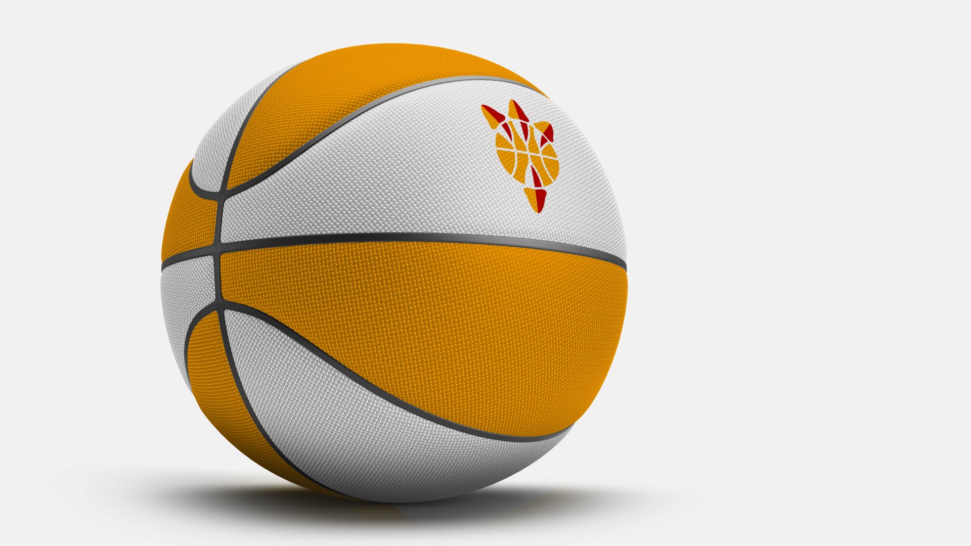
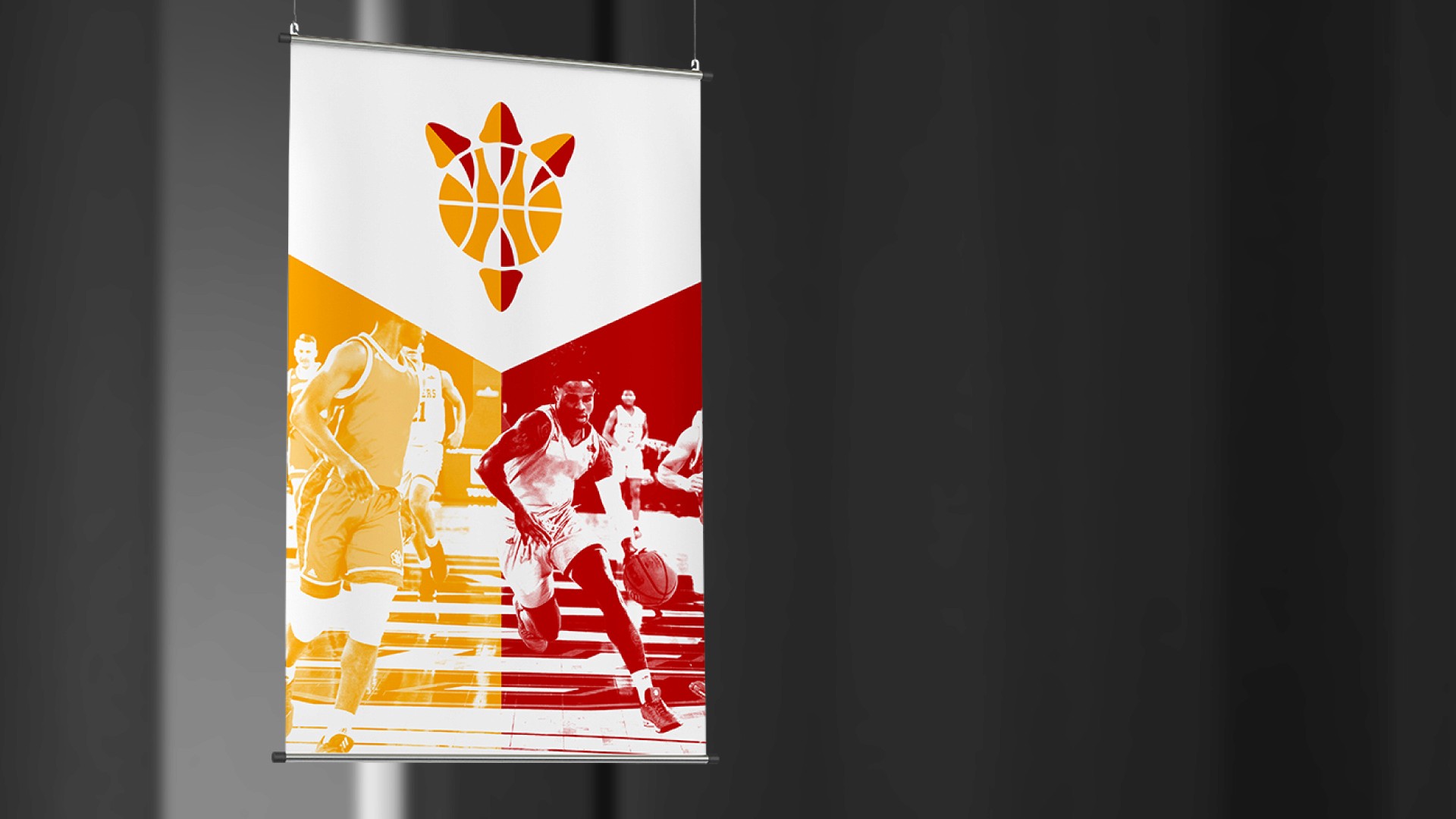
I chose to go with the idea of talons gripping a basketball for the final logomark. After some experimentation, I made the logo more geometric in order to create a cleaner, simpler look. I wanted the logo to convey both talons and the sport of basketball in a simple yet unique and memorable form, which I believe it does successfully.
